

.svg)
In this article
Never miss new content
Too many org charts are still cobbled together in PowerPoint, Excel, or Miro.
Visually, those tools can work. But they’re time-consuming to maintain and instantly outdated the moment someone is hired, promoted, or leaves. Instead of helping leaders plan, these static charts trap them in a snapshot of yesterday’s organization.
Modern org chart software changes that equation. By syncing directly with HR systems and updating automatically, these platforms give leaders a living, accurate view of their workforce. That real-time visibility turns the org chart from a static diagram into a dynamic blueprint for how the business runs today and where it’s headed tomorrow.
What is org chart software?
Org chart software is a digital platform that creates a living, interactive view of your company’s structure. Unlike diagrams built in PowerPoint, Excel, or Miro, it pulls directly from your HR systems to show an always-accurate picture of your workforce. That includes who reports to whom, how teams connect, and where future roles will fit.
The difference comes down to automation and collaboration. Instead of spending hours manually updating boxes and lines, modern org chart tools sync in real time with HRIS and ATS platforms. That means every hire, promotion, or departure is reflected automatically. Many platforms also include filtering, search, and sharing features so HR, Finance, and business leaders can work from the same source of truth.
Companies use org chart software for all kinds of everyday needs: helping new hires understand the team from day one, mapping potential restructures, giving leaders visibility into team size and composition, or aligning hiring plans with business goals. With real-time data behind it, the org chart stops being a static document and becomes a practical tool for running the business.
What to look for in org chart software
On the surface, most org chart platforms look the same. They all promise real-time visibility and easy setup. But the real differences emerge once you dig into how they handle data, security, scalability, and collaboration. Whether you’re evaluating your first tool or replacing a legacy system, here’s what to look for.
Essential features
A great org chart platform goes beyond visualization. It becomes a living map of your workforce. The most capable tools share a few critical traits:
- Real-time integrations. The best org chart software connects directly to your HRIS, ATS, and payroll systems, updating automatically as new hires join, titles change, or internal transfers. Manual uploads or nightly syncs can’t deliver the same accuracy.
- Custom fields and data flexibility. Look for tools that let you display more than names and titles. You should be able to include attributes like department, location, tenure, compensation, or performance data, turning your chart into a live reporting dashboard.
- Role-based permissions. Not everyone should see the same data. Granular access control allows Finance, HR, and business leaders to collaborate in one shared view without exposing confidential information.
- Scalability and performance. As companies grow, org charts often break under their own weight. Choose a platform that can handle thousands of employees, multiple entities, and complex hierarchies (matrixed or federated) without lag or manual maintenance.
- Collaboration and shareability. Dynamic org charts should make it easy to collaborate. Features like commenting, sharing links, and embedding charts in tools like Slack or Notion keep everyone working from the same source of truth.
- Visualization and modeling. Advanced platforms let you model different structures or “what-if” scenarios directly in the chart. This is key for planning restructures, headcount forecasting, or testing different reporting lines before changes go live.
These capabilities turn an org chart from a static diagram into an active, collaborative system for managing people and planning growth.
Pricing and licensing
Cost can be difficult to compare across vendors. Most tools fall into one of two models:
- Per-user pricing, where you pay for each active user who logs in. This is common with collaboration-focused tools like Lucidchart or Pingboard. It’s predictable for small teams but can spike as usage expands.
- Per-employee pricing, where costs scale with your total headcount, regardless of how many people use the software. Enterprise platforms like OrgChart use this model, which can make sense if only HR and Finance need admin access.
But the list price rarely tells the whole story. Ask about hidden costs like setup or implementation fees, custom integration charges, paid training or certification programs, and premium support plans. Even a small per-user fee can balloon once those add-ons appear.
A smart approach is to model costs three to five years out, using your projected headcount and admin needs. Many buyers underestimate how quickly org complexity (and workforce spend) can grow.
Matching features to your organization
The right tool depends on the current size and growth rate of your organization.
- Early-stage startups and small teams. You need speed and simplicity. A lightweight tool that imports data from spreadsheets or basic HRIS systems can give you visibility without overcomplicating workflows.
- Mid-size and scaling companies. Real-time HRIS sync and data accuracy matter most. When you want to leverage more planning functionality, you’ll want integrations with FP&A and ATS tools as well.
- Enterprises. Prioritize governance, scalability, and security. You’ll want SSO and MFA support, detailed audit trails, and the ability to visualize multi-entity or matrixed reporting. Integrations with ERP and FP&A platforms should be non-negotiable.
The right org chart software should give you clarity, not just a visually appealing diagram. It should save you time, improve collaboration, and give leaders the visibility they need to grow with confidence.
The 8 best org chart software options to choose from
Choosing the right org chart software is all about finding the right combination of capabilities for your company’s structure, size, and systems. Some platforms focus on design flexibility, others on analytics or employee engagement. The most advanced options, like TeamOhana, combine those elements with real-time headcount data and workforce planning features built for scale.
The table below offers a snapshot of leading tools to consider in your search.
1. TeamOhana
Most org chart tools offer a static snapshot of who’s in the company today. TeamOhana’s dynamic org chart goes further, combining current and forecasted headcount in a single, live view so Finance, HR, and Talent teams can plan, forecast, and act together.
By connecting live data from your HRIS, ATS, and FP&A systems, TeamOhana eliminates the manual updates that plague traditional org charts. Instead of static PowerPoint slides or disconnected spreadsheets, leaders can explore, model, and edit the full structure of their company (past, present, and planned) in one interactive view.
Key capabilities
- Unified headcount data. Syncs live with HRIS, ATS, and FP&A platforms like Workday, Greenhouse, Ashby, BambooHR, Pigment, and Anaplan for a single source of truth.
- Current + future headcount visibility. Displays active employees, open reqs, approved-but-not-open roles, and planned departures together for a true effective headcount view.
- Drag-and-drop editing. Move open roles, reallocate headcount, or adjust team structures directly within the chart. Visualize changes instantly, see their budget impact, and send updates for approval all within the same workflow.
- In-chart actions and approvals. Leaders can request new headcount, promote team members, or backfill roles right from the chart. Every change routes through built-in approval workflows and syncs automatically to Finance.
- Scenario modeling. Run what-if analyses to test restructures, hiring freezes, or budget shifts before they happen.
- Flexible, analytical views. Use drag-and-drop visuals, filters, and insights to analyze the org by department, tenure, seniority, or cost center.
- Collaboration and governance. Comments, notifications, and role-based permissions make it easy to collaborate securely while protecting sensitive data like compensation or upcoming exits.
“The dynamic org chart feature enables functional leaders to visualize, plan, and manage their teams with accurate information at any time.” — Holly Cafiero, Chief People Officer, Newsela
Pricing
TeamOhana pricing uses a custom model based on company headcount and system integrations. Plans are designed to scale with growth — from smaller teams centralizing headcount management for the first time to global enterprises replacing spreadsheets entirely.
Each plan includes:
- Full access to the dynamic org chart
- Integrations with core systems (HRIS, ATS, FP&A)
- Unlimited role-based viewers
- Enterprise-grade security and audit trails
- Custom enterprise packages include advanced workforce scenario planning, dedicated implementation support, and premium integrations with systems like Workday and Pigment.
Why it stands out
TeamOhana is the only platform that merges org design, headcount planning, and budget forecasting in one real-time system. Instead of creating a chart for visibility, you’re building a shared environment where every structural change is immediately reflected in your plan.
For companies scaling quickly or simply tired of reconciling data between teams, it’s a shift from static visualization to true workforce intelligence.
2. ChartHop
.png)
Best for: Mid-to-large enterprises that need a centralized view of HR and compensation data.
ChartHop approaches org charts through the lens of HR analytics. It’s designed to bring together people data from systems like Workday, Greenhouse, and ADP, allowing leaders to analyze compensation trends, DEI metrics, and performance indicators within a single platform. For companies struggling to reconcile data across multiple HR systems, it offers meaningful clarity and reporting power.
That focus, however, keeps ChartHop rooted in data visualization rather than planning. Its org chart acts as a dashboard for analysis, not as an active workspace for modeling future scenarios or managing hiring plans. Actions such as opening new roles, reallocating headcount, or adjusting budgets still require external processes. As a result, the platform tends to serve HR analytics teams more than cross-functional leaders responsible for operational planning.
ChartHop’s enterprise capabilities come with a higher price and implementation effort than other standard org chart software. Contracts typically start around $9,000 per year and require clean, structured data to perform effectively. Users appreciate its data integration strength but often note the learning curve and limited flexibility for non-technical users.
In short, ChartHop excels at explaining the organization as it exists today. But for companies that also need to design what comes next, a more dynamic, planning-oriented platform like TeamOhana offers a broader solution.
3. Sift
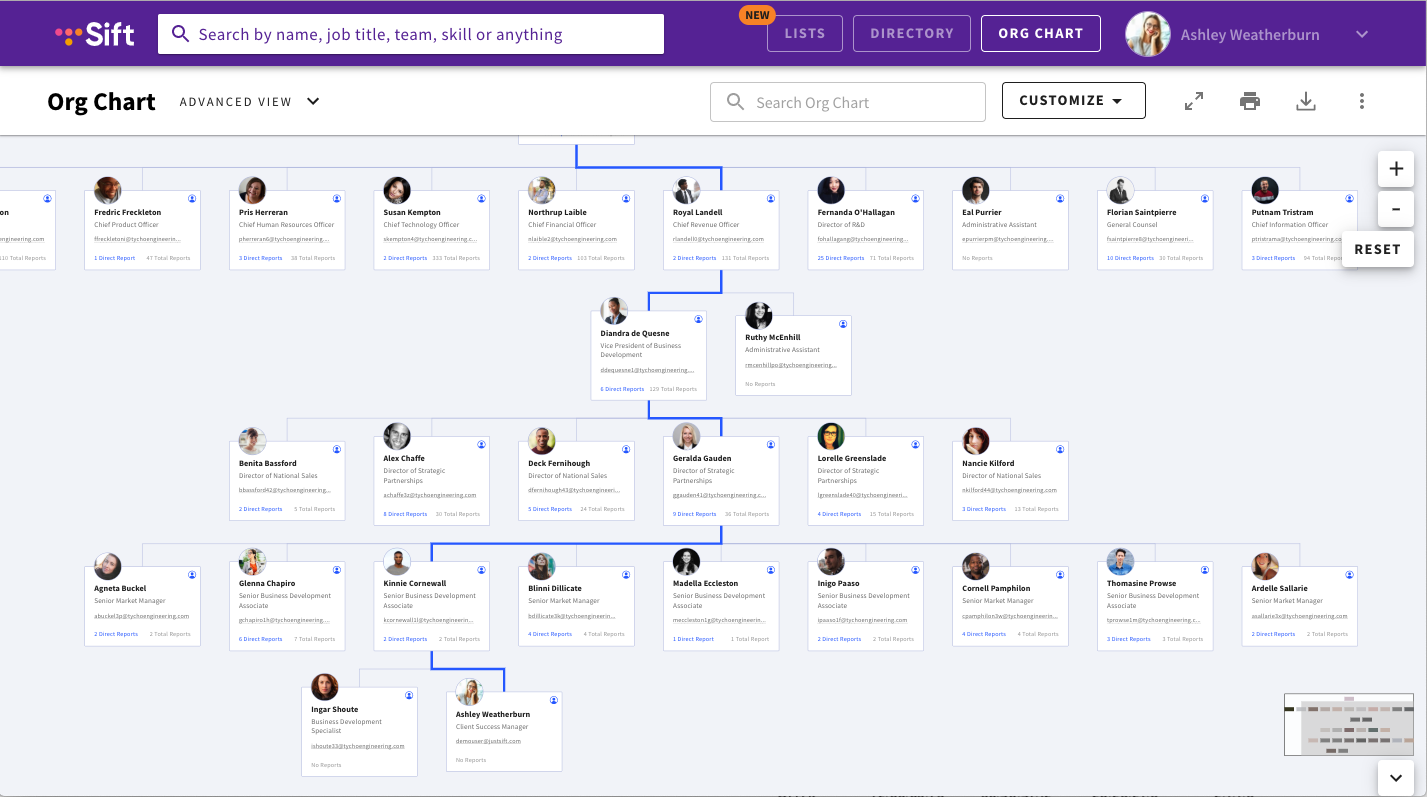
Best for: Growing organizations that need a searchable, dynamic employee directory rather than a planning or modeling tool.
Sift takes a different approach to organizational visibility. Rather than emphasizing hierarchy or structure, it functions as a people discovery platform — a searchable, interactive directory where employees can find colleagues by name, department, or skill set. It’s especially well-suited to large or distributed organizations that value connection, transparency, and internal knowledge sharing.
The platform builds rich employee profiles by syncing with HR and IT systems, allowing users to view job titles, reporting lines, and expertise areas in a single interface. Its underlying architecture is praised for handling large data sets with speed and stability, making it a strong fit for enterprises where people data changes frequently or teams operate across regions and time zones.
However, Sift’s functionality stops at visibility. It doesn’t extend into forecasting, budget planning, or workforce modeling activities that link structural insight to operational strategy. For HR and Talent teams, that means Sift provides a valuable reference for who’s here and what they do, but not for how the organization will evolve.
User sentiment reflects this distinction: Sift is considered one of the easiest-to-use directory tools on the market, with intuitive navigation and fast search capabilities, but it lacks the workflow depth of a platform built for cross-functional planning and approvals. For leaders seeking to understand relationships and expertise, Sift performs well. For those trying to plan headcount or anticipate change, it leaves a gap that TeamOhana fills.
4. Pingboard
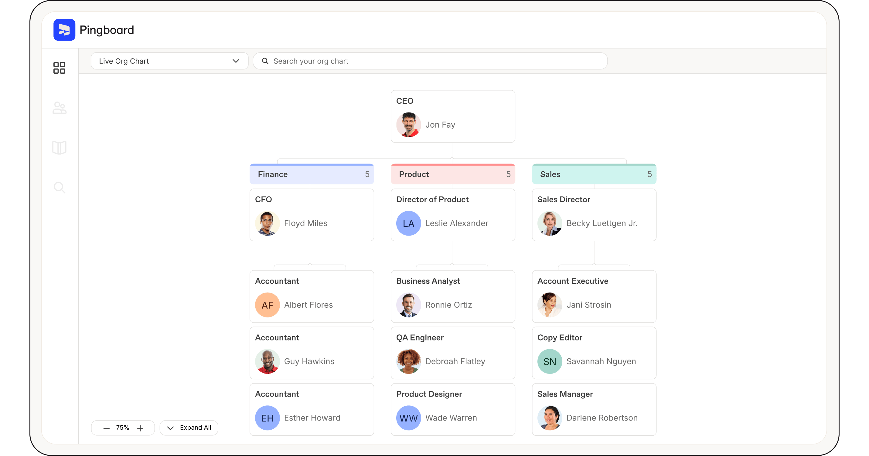
Best for: Small to mid-sized companies that want an automated org chart and employee directory without heavy setup or analytics.
Pingboard focuses on simplicity. It automatically generates an up-to-date org chart by syncing with popular HR systems like BambooHR and Namely, eliminating the need for manual edits. For many small and mid-market organizations, that automation alone solves a major pain point, keeping the org chart accurate as hiring, promotions, and departures happen.
Beyond structure, Pingboard also serves as a light employee directory. Team members can browse profiles, check availability or vacation status, and get a clearer sense of who’s who across departments. This focus on accessibility and ease of use has made it a go-to option for teams that value transparency and connectedness.
That ease, though, comes with limitations. Pingboard’s capabilities stop at data reflection. It shows what the organization looks like today but doesn’t support deeper modeling or future planning. There’s no way to visualize approved but unfilled roles, assess budget impact, or run what-if scenarios when teams change. For Finance and HR leaders trying to connect structure to cost and forecasted hiring, those gaps are meaningful.
Users describe Pingboard as reliable, intuitive, and inexpensive, but also note that it quickly hits its ceiling as companies scale. Once headcount surpasses a few hundred people or planning becomes more complex, organizations often outgrow its feature set. It’s a dependable solution for maintaining visibility. But for teams that need to plan their workforce, not just view it, a platform like TeamOhana offers far more operational depth.
5. Organimi
Best for: Small and mid-sized organizations that need a visually rich, easy-to-manage org chart without complex integrations or setup.
Organimi is a purpose-built org chart and directory tool designed for clarity and accessibility. It runs entirely in the cloud and allows HR teams to create and update charts quickly using a drag-and-drop interface or by importing data from spreadsheets. The platform emphasizes visual customization. Companies can adjust colors, layouts, and profile formats to produce polished charts that communicate structure clearly to internal and external audiences.
For organizations that lack a dedicated HRIS or operate with simpler workflows, Organimi delivers strong value. It’s straightforward to set up, doesn’t require IT support, and provides better visual control than general-purpose diagramming tools. Users often cite its intuitive design and clean presentation as standout benefits, especially when communicating company structure during onboarding or leadership reviews.
However, Organimi’s simplicity also defines its limits. It doesn’t connect deeply with HR, ATS, or financial systems, meaning charts must still be updated manually or through CSV imports. There’s no built-in forecasting, cost modeling, or approval workflow — functions that become increasingly critical as companies grow and headcount decisions carry financial implications.
In practice, Organimi serves best as a communication tool rather than a planning one. It helps teams visualize today’s organization but doesn’t support the data-driven decisions behind tomorrow’s. For companies that want to move from visualization to scenario modeling and budget alignment, a dynamic platform like TeamOhana offers a more integrated approach.
6. OrgChart
Best for: Enterprises that need highly customizable org structure modeling and formal succession planning tied to HR data.
OrgChart is one of the more mature platforms in this space, built specifically for organizations that need deep control over how structures are modeled and maintained. It connects to a wide range of HR systems — more than 50 in total, according to the vendor — and automatically builds org charts from live data. This makes it particularly valuable for large companies where accuracy depends on constant synchronization with complex HRIS environments.
The platform’s standout capability is its customizability. Users can create detailed visualizations that reflect multiple reporting lines, specialized hierarchies, or planned re-organizations. Many HR teams use it to model future states, test restructuring ideas, or prepare succession scenarios that require detailed data visibility. This precision makes OrgChart especially useful for organizations with established HR analytics or workforce design functions.
That same flexibility, however, introduces complexity. The interface is utilitarian and can feel dated compared to more modern SaaS products. Configuration often requires specialized setup and a strong understanding of data structures, which can slow adoption outside of HR’s core team. Performance can also lag when handling very large data sets, and pricing — based on total employees charted — scales quickly as headcount grows.
User sentiment generally reflects respect for its power but acknowledgement of its demands. HR leaders value its accuracy and modeling depth but note that it’s best suited to organizations with the internal resources to maintain it. For companies that need a dynamic org chart built for cross-functional planning and collaboration, not just technical precision, a lighter, real-time solution like TeamOhana offers broader usability across Finance, HR, and Talent teams.
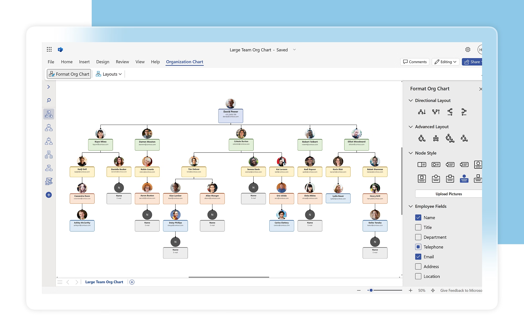
7. Microsoft Visio
Best for: Large organizations already invested in the Microsoft 365 ecosystem that need detailed, presentation-ready diagrams.
Microsoft Visio has long been the default choice for professional diagramming, and its org chart capabilities reflect that heritage. For enterprises that already rely on Microsoft tools, Visio integrates seamlessly with Excel and Teams, allowing users to generate structured org charts directly from spreadsheets. Its precision and template variety make it ideal for producing polished diagrams for leadership decks or compliance documentation.
Visio’s strength lies in its diagramming fidelity. The ability to create complex, technically accurate visual representations of organizational structures and other processes. It’s well suited for power users who value total control over layouts, connectors, and labels, and for teams that already manage workforce data in Excel or Power BI.
That level of control, though, comes at the cost of efficiency. Visio is not an HR tool; it has no direct connection to HRIS or ATS systems, so charts require regular manual updates. Collaboration features are limited compared to modern, cloud-native solutions, and the licensing model that’s often tied to Microsoft enterprise subscriptions can make it expensive for smaller teams or non-technical users.
User feedback consistently praises Visio’s professional output but calls out its lack of automation and ease of use for day-to-day updates. It’s best for visual accuracy, not for ongoing management. For teams that need their org chart to evolve automatically with hiring, promotions, and budget changes, a live, integrated solution like TeamOhana eliminates the repetitive maintenance work Visio still demands.
8. Lucidchart

Best for: Cross-functional teams that need a versatile, cloud-based diagramming tool for collaborative visual work.
Lucidchart is one of the most widely used visual collaboration platforms, known for its flexibility across use cases like process mapping, architecture diagrams, flowcharts, and, of course, organizational charts. For teams that value fast setup and broad accessibility, it offers an intuitive drag-and-drop interface and real-time co-editing features that make it easy for multiple users to work in the same document simultaneously.
Because Lucidchart supports integrations with tools like Google Workspace, Slack, and Microsoft 365, it fits naturally into existing workflows. Organizations can import org data from spreadsheets or Google Sheets to generate charts quickly, which makes it a convenient option for startups or departments that don’t need formal HR integration. The platform’s strength lies in how easily teams can visualize and share ideas across functions.
However, Lucidchart’s org chart functionality is limited to visualization, not workforce planning. It doesn’t connect directly to HR systems or update automatically when people data changes, which means charts must be maintained manually. As companies scale, this manual upkeep becomes a recurring source of frustration. Users also note that while it’s excellent for collaborative diagramming, it lacks the structure, approval flows, and real-time data integrity needed for headcount management.
Overall sentiment toward Lucidchart is positive. It’s simple, affordable, and effective for general visualization. But users frequently describe org chart maintenance as time-consuming. It’s a strong fit for creative or operations teams that just need a flexible diagramming tool. For Finance, HR, and Talent teams responsible for managing live workforce data, a purpose-built platform like TeamOhana provides the automation and planning context that Lucidchart intentionally leaves out.
Find the right org chart software for your business
The right org chart software should do more than map reporting lines—it should give your organization the clarity to plan for what’s next. Tools like Lucidchart, ChartHop, and others each play a role in visualization or analysis, but TeamOhana combines those capabilities in one platform built for real-time headcount planning and organizational design.
Check out how the TeamOhana dynamic org chart can give your team a single, accurate view of your people and your plan. Book a demo of TeamOhana today.
Take control of your headcount spend

Org chart software FAQs
Simplifying TeamOhana: your questions, answered.
Org chart software is a digital tool that helps companies visualize their organizational structure in real time. Unlike static charts built in PowerPoint or Excel, modern platforms connect directly to HR systems to display current employees, open roles, and reporting relationships automatically. Some solutions, like TeamOhana, go further by combining visualization with workforce planning, budgeting, and approval workflows.
Specialized org chart software eliminates the manual updates, version control issues, and data inconsistencies that come with spreadsheets and slide decks. It creates a single source of truth for your workforce, allowing HR, Finance, and business leaders to see the same structure and act on the same data. The result is faster decision-making, more accurate forecasts, and greater organizational transparency.
When evaluating org chart tools, focus on three things: data accuracy, scalability, and usability. The best software connects directly to your HRIS and ATS to keep data current, supports your company’s complexity as it grows, and makes collaboration easy across teams. You’ll also want to assess cost structures and integration options to ensure the platform fits your long-term planning and budgeting needs.
Most HCM org charts only show your current workforce. TeamOhana connects that same HRIS data with your ATS and approved headcount plan to display both current and future roles in a single, dynamic view. You can even assign existing employees to managers or positions that haven’t been hired yet to preview how the organization will evolve. And with built-in scenario planning, leaders can model different structures, test budget impact, and make informed decisions before implementing any change—something static HCM org charts can’t do.


