%201.avif)
.svg)
In this article
Never miss new content
We are thrilled to introduce the new TeamOhana brand identity including a new logo, colors, fonts, design elements, and a brand new website!
Our mission is to empower companies to scale with confidence by aligning teams and using AI to turn headcount into a strategic, trusted engine for growth. Our new brand identity embodies this mission.
Why now is the time for us to rebrand
When Tushar Makhija and Baishampayan “BG” Ghose founded TeamOhana in 2021, the tech world was booming. Companies hired fast, efficiency was an afterthought, and growth-at-all-costs reigned supreme.
But as we all know, times have changed. Funding is tight and capital efficiency is now front and center. To thrive today, companies must master workforce planning and make every dollar count.
Our goal at TeamOhana has always been to empower fast-growing companies with the most effective headcount management platform—so they can move fast and hit their goals while staying within budget. And as the needs of workforce planning teams have evolved over the last 4 years, so has TeamOhana.
Thanks to thoughtful feedback and collaboration with our customers, TeamOhana has grown into a robust platform helping companies manage $6 billion in workforce spend across more than 30,000 employees.
Now, we’re entering an exciting new chapter. We’re scaling Agentic AI for workforce planning, and will soon follow that with advanced capacity planning, and a new way to manage reorgs and org planning. And with this product evolution comes a refreshed brand—one that reflects where we’re headed next.
“We are now ready to launch our new brand and launch ourselves as the leaders and the pioneers in the workforce planning category,” explains Tushar. “This rebrand represents TeamOhana’s bold new direction in agentic workforce planning for the enterprise.”
The new look of TeamOhana
TeamOhana’s new brand identity and website, crafted by Frank Works, visualizes workforce planning as a perfect whole—an elegant circle of interlocking pieces, each representing a vital component of the system. From a distance, these elements move in harmony, symbolizing the seamless integration of talent strategy and operations.
Zooming in, each piece reveals its own depth and nuance, reflecting the insight and intention behind every feature. The Swiss minimalist approach embodies our philosophy: structured yet fluid, simple yet powerful—giving teams the clarity they need to grow with confidence.
Logo
As OG TeamOhanians know, our original logo was inspired by Tushar and BG’s favorite fruit—the persimmon. It’s become a fan favorite among our team and customers. So, while we are launching a new logo, we aren’t saying goodbye to the persimmon, but rather “Aloha”.

The orange persimmon will now be the logo of our exclusive Slack community, The Ohana. If you’re a workforce planning professional and you’d like to join our Slack community, drop us a message and we’ll be happy to send you more information.
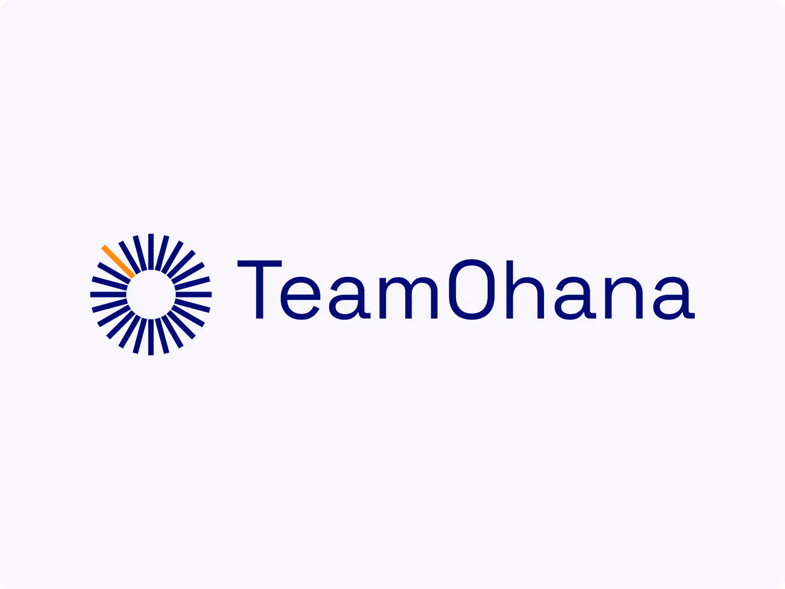
Our new logo is an evolution of the original, in line with the evolution of our platform. The new logo represents workforce planning as a sun dial of interlocking components, symbolizing the harmonious integration of talent strategy and finance operations.

“This evolution of our logo represents agility and adaptability. It suggests the underlying complexity and the importance of our work,” explains BG. “It’s less about a literal representation, and more about the potential that it unlocks. It marks a new beginning for us.”
Color palette
Our new brand color palette was developed based on Mindful Palette #113 by Alex Cristache.
Our new primary colors are Deep Space and Luster White. Deep Space represents trust and Luster White represents clarity—because TeamOhana delivers data headcount planning teams can trust, giving them the clarity they need to grow with confidence.

Our bold secondary color palette rounds out our overall color scheme. We included Habanero because a bold orange has been part of our brand since day one and as Tushar would say, “we need some spice.”

The Aster Flower blue is my personal favorite, especially in combination with Habanero. These hues bring a vibrant energy to our brand personality, representative of our value of empowerment.
Typefaces
Our new primary typeface is Space Grotesk, designed by Florian Karsten, and hand selected for our brand by BG.

Our secondary typeface is DM Sans, designed by Colophon Foundry.

These fonts combine bold styling with easy readability, reflecting a balance of power and bold decision-making with clarity.
Website and design elements
If you’ve landed on this blog, you’ve probably already had a look around our new website. But if not, I invite you to check out our homepage and take a journey around our new site.
You’ll find animations on various pages that spin, move, and deconstruct our sun dial with graceful agility. These are intended to reflect the concept of the sum being greater than its individual parts—or elite workforce planning only being achievable when each team and workflow is synchronized.
Refining our voice
Along with our new visual appearance, the team at Harmonic Message refined our product and brand messaging. They carefully crafted each sentence on our revamped website pages based on deep product research, interviews with our team, and conversations with our customers.
The new TeamOhana brand voice is clear, concise, and friendly, much like our platform.
A new beginning
We are psyched to share our new brand identity, but this is only the beginning. Big things are on the horizon here at TeamOhana. If you’d like to learn more about Agentic AI or see our platform in action, get in touch. We’d love to hear from you.
Take control of your headcount spend